Columbus Soccer Club on Monday announced updated brand marks while embracing the Crew’s history and tradition of the club and its trademark Black & Gold colors.
The Crew’s new marks set to elevate the city of Columbus, recognizing the global stage of soccer and the opportunity to represent the city for which they play, the club said in a release. The new crest will be used interchangeably with Columbus SC.
“The current direction of our Club and our city provides a natural time to examine our identity going forward,” said Crew President & General Manager Tim Bezbatchenko in a club release. “Our identity and brand evolution includes a shift in our mindset to be consistent contenders on the pitch, but also includes evolving our look both in the community and across competitions. With the upcoming completion of our new, modern, dynamic stadium, our world-class OhioHealth Performance Center, and coming off an MLS Cup championship, our marks are aligned with where we are headed as a city and as an organization. We are proud to represent Columbus on the global stage of soccer and aspire to help elevate the city and honor it for what it has done for the Club. We are Columbus Soccer Club, we are The Crew, and we will always be the Black & Gold.”
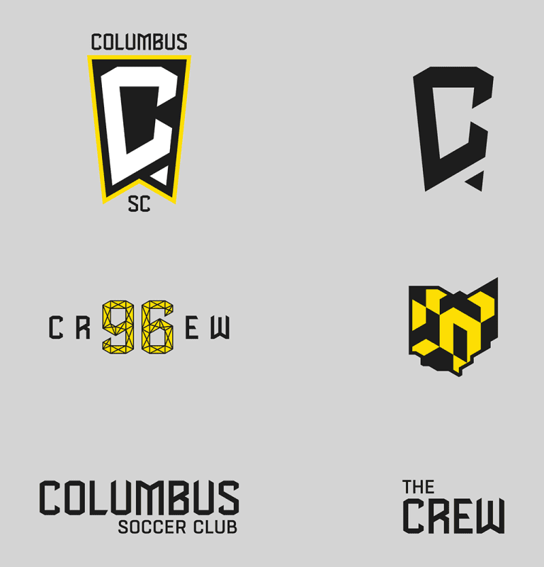
The Icon C indeed represents the Crew primarily and also Columbus. The state of Ohio flag forms the overall shape of the shield. The new marks authentically incorporate symbols (checker flag to present the diversity of our fans, Ohio state flag to represent Ohio’s first MLS team, Short North arches and stadium geometry to inspire our new font) meaningful to the region and our supporters and represent an evolution of the club's tradition.


